Lilium Aureum (part two): Painting the Scroll

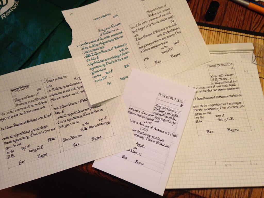
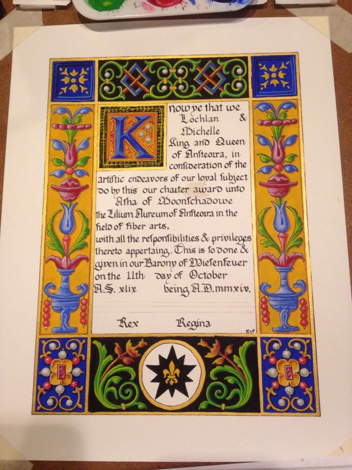
Commence Part Two! The first thing I did was to fill in the rest of the calligraphy. I tend to be pretty confident when it comes to my calligraphy (I have a tendency to give one of my mentors heart attacks because when I work with other illuminators, I’ll do the calligraphy after theyre finished painting instead of before they start), but there’s no use tempting fate.

flatsprogress

I painted the borders gold with some gold watercolor I’ve had laying around for a while. Or maybe it was the Winsor & Newton gold gouache? I can’t remember. I wanted something shiny in there. I also chose black and gold for the backgrounds of the biggest areas to better represent Ansteorra. The blue was because I thought it looked rich and opulent. You may notice that there’s a big ocher blotch in the middle of the calligraphy. Yeah. That’s what happens when you try to paint during an allergy attack.

flatsprogress2

The background flats are all finished here, and I’ve started filling in some of the foreground flats. I’ve blotted away the excess paint in the mistake, and dabbed it with a little water to pick up what I can of it. Then I’ll let it dry over night and then scrape off what I can of the paint that’s left with a scalpel blade (seriously, scribes: scalpels. Cheaper than exactos and sharper, too).

flatsfinished

The foreground flats are all finished. You can see how strikingly graphic and beautiful this design is when painted with just flats. It was a huge relief to me to see that, since it was a consideration in my design. I’ve tried to not paint over the lines, but not made a huge deal of it, since there were no outlines in the inspiration piece. I’ve scraped away most of the yellow paint in the mistake, but it’s not completely gone. I’ll have to paint over it with white in order to fix it.

shadingstart

Starting in on the shading. I suppose this is as good a time as any to talk about paint. I use gouache, an opaque watercolor consistig of pigment (the color), gum arabic (the binder that holds the pigment together), and chalk, or other inert substance (to make to opaque). I tend to use artist grade paints, a legacy of my time in art school, but a mixture of brands. I could probably write up a whole post on the paints I use, with comparisons. In fact, I probably should.

shding2


And the majority of the shading finished. For the most part, it’s achieved by hatching and cross-hatching a highlight color, either white or yellow, on top of the base color. I used a teeny-tiny round brush (3/0 or 4/0 I think) to do the shading.

shading3

A closer look at the left side of the scroll. There will be a drop-shadow added behind the ornaments, too, to heighten the illusion of dimentionsality.

finished1


Finished scroll! I’m really pleased with the way that it came together, although I think the filigree work around the versal was a little haphazard. But I know that Asha loved her scroll (her mum told me so!) and that’s really all that matters to me.

Lilium Aureum (part one): Creating a new charter

Not too long ago, at our local Larurel’s Prize Tourney (I have picture of that coming soon), I was approached and asked to design a charter for a new children’s A&S award. For those of you unfamiliar, a charter is a scroll that has spaces left blank for the recipient’s name, the date, royal signatures, etc. They also usually have linework designs on them, so each can be painted individually. I’ve never made a charter design before, and I was thrilled to be asked. It turns out that charter-designing is pretty different from one-off scroll-design.

First, I needed some inspiration. It was a tough decision, actually. I needed a design (a later period design, at the request of Their Majesties) that was complex enough to stand on its own if a very beginning painter just used flat colors, and something that would give more advanced painters the chance to go to town with shading if they wanted to. In the end I went with Francesco Marmitta’s Rangoni Bentivoglio Book of Hours, an Italian work from around 1500. It’s currently housed at the Walters Art Museum in Baltimore.

LA: sketch

Not shown: taking ideas from several leaves of the Book and sketching them out on graph paper to get the proportions right within my space limitation. I then brought the images into photoshop to get everything the way I wanted and mirrored without a whole ton of problems. Then I traced the image onto tracing paper so I could easily transfer it to the final working paper.

calligtest1

I knew I wanted to make sure the hand was consistent with the illumination style, so I went through all the pages I had and pulled out several letters that appeared on them. To fill in the gaps, I looked through Stan Knight’s amazing book Historical Scripts from Classical Times to the Renaissnce for similar times and places.

calligtest2

I did a couple of calligraphy drafts…

allthetests

And then a couple more. The problem with creating a charter is that you have to leave space enough for a hugely long name (because someone might have picked Tangwystyl Fairehayvenn of Llanleystocke as a name, rather than John York), a hugely long area of expertise (again, calligraphy and illumination, as opposed to gaming) and placename. Trying to make sure that each of those had enough space, as well as the date, years, and signatures was difficult. I went through six different drafts, instead of my normal two or three. At least it gave me the time to practice my hand?

startingpencils

I use a small lightbox (9×13 or so) to stransfer small scrolls like this one. For larger scrolls, I tape the paper to my french doors. Thank goodness for th Texas sun. A friend of mine is actually going to make me a bigger light table, large enough to do peerage-sized scrolls. He made his wife one, and I’m intensely jealous. I trace out all my linework with 5mm mechanical pencil, in 2H hardness. I like the darkness of the line; I can see it well enough to ink, but it’s still easy to erase after, and the 5mm makes a consistently fine line on the paper.

calligfinal

Incidentally, I’m using Fabriano hot press watercolor paper here. It’s smooth and delicious to write and draw on, the ink I’m using (Scribal Arts Iron Gall ink for calligraphy, Platinum carbon blank ink in a LAMY fountain pen with extra-fine nib for the artwork) doesn’t bleed or feather, and it holds up to abuse (lots of wet paint, and scraping and burnishing for corrections) well.

Here you can see the pencils are all finished, and I’ve calligraphed the charter text. I’ll go back in later and fill in the premiere recipient’s information later.

nearlydoneinking

Nearly finished inking. I’ve tried to reduce the lovely design into linework that evokes the delicate nature of the original without being too intimidating to paint.

finishedcharter


And the charter is finished. At this point, I’ll wait for the ink to dry overnight to avoid any smearing of lines when I go back and erase the pencil guides. Then I’ll scan it into photoshop and correct any little tiny errors before printing out a nice bold master copy for our Star Signet (the scribe in charge of kingdom charters).

In the next installment, we’ll see how this goes from charter to finished award.