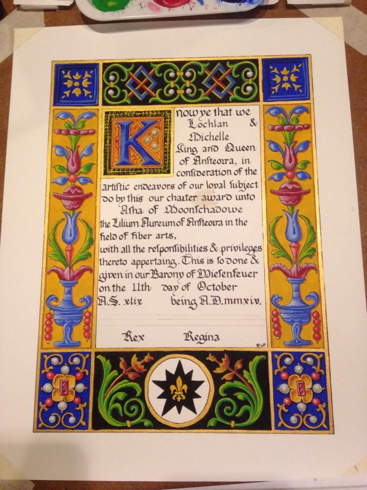
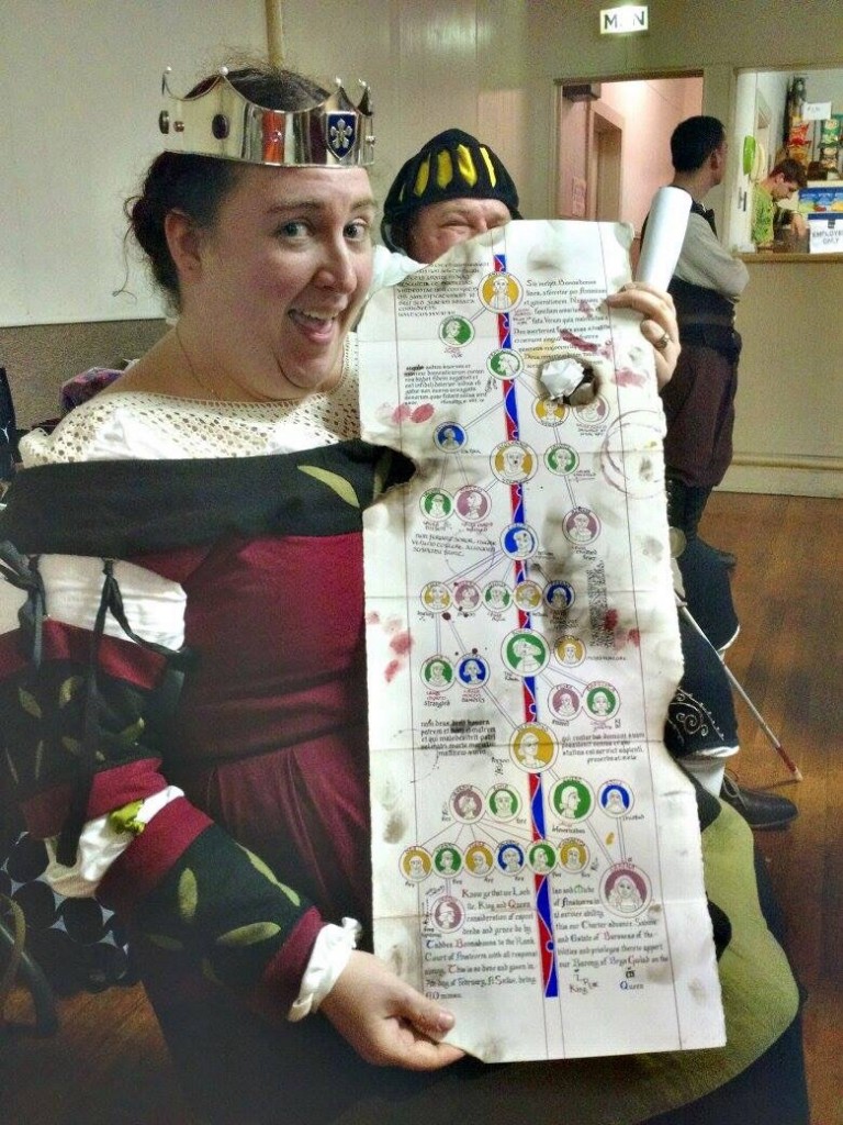
Court Barony Scroll for Sabina

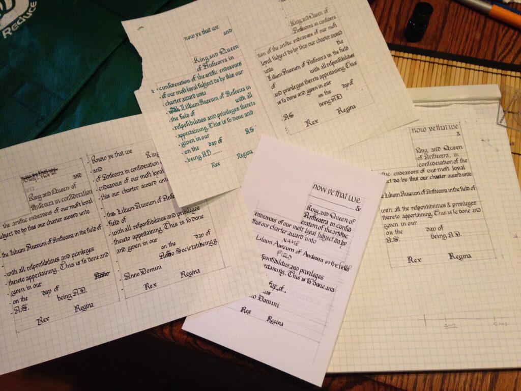
I was commissioned by a friend to make, in secret, a Court Barony scroll for his wife, Sabina. He had some very specific ideas for what he wanted it to look like. He wanted a very long scroll, that could be unfolded (and unfolded and unfolded). He wanted a genealogy, going back to the line’s founder, and ending in Sabina. Her persona is Italian, so he wanted a very Borgia-like family, plagued by misfortune and calamity (some of it wrought by other family members).

f7e47262267654c87e8c8f13c267c49f

Looking around, I found a manuscript, the Genealogy of Christ by Peter of Poitiers (ca. 1130-1205, which is way early for a Venetian courtesan, but who’s telling this story?!) that we both liked the bold, graphic nature of.

Sabina's Court Barony Scroll

I started off by measuring the longest sheet of paper I had, Somerset printmaking paper. It turned out to be 30″ long. I settled on making the scroll 11″ wide, to make it look even longer proportionally. I taped two pieces of graph paper together and marked off 1.5″ margins all around. Then I marked out the central line and circles where I thought they’d look pleasing. It should be noted that this is not meant to be an accurate family tree, even for her persona. It’s meant to be a prop that looks good, and is accidentally a legal document.

Sabina's Court Barony Scroll

The design was inked to allow for easier tracing via lightbox.

Sabina's Court Barony Scroll

Using my patented Giant Natural Lightbox technique (ie: taping the papers to my french door and tracing the lines), I transferred my design onto the final paper. You may not that I didn’t do any “wet-fits,” or making sure that the calligraphy would fit into the allotted space. If you look at the original manuscript, the text is rather jammed in around the lineage. I wanted the same look. I did, however, leave what I was pretty sure would be enough space at the bottom for the actual award text.

Sabina's Court Barony Scroll

I inked the initial lines in red. Originally I used brazilwood, but I think perhaps some remaining iron-gall ink in my nib oxidized with it and instead of a lovely light pinkish-red, it darkens to a pretty (but incorrect) purple. Instead, I used a red india ink.

Sabina's Court Barony Scroll

You can see my first serious screw up. I traced the line with my ruler upside down and the ink bled underneath it. I love my first screw-up of a project. It keeps me from being too precious about the rest of it.

Sabina's Court Barony Scroll

And for a mistake, it’s easily fixed by scraping the top layer of the paper off with my scalpel and burnishing the fuzzy spot that’s left. The green inner circles were drawn with watered down gouache, and the faces were sketched in (very loosely, this is not a time for perfectionism) and then inked with my favorite Scribal Workshop Iron Gall ink.

Sabina's Court Barony Scroll

Portraits are all finished! That’s Sabina at the bottom right. It kinda looks like her, too.

Sabina's Court Barony Scroll

Side by side comparisons of the design paper and the in-progress scroll. All the painting is finished there; I’m particularly proud of the central stripe. It’s so lovely and graphic.  Sabina's Court Barony Scroll

A close-up of the portraits. They got a small bit of shading after this picture; I thought they looked a bit too flat, even for this style.

Sabina's Court Barony Scroll

Names and causes of death filled in. Like any good Venetian family, lots of poison, lots of war, lots of killing each other in underhanded ways. Even one “defenestration,” which is being thrown out a window. Sabina's Court Barony Scroll

And with the text and marginalia written in. The actual award text is in English, while the marginalia is in Latin. I wanted the writing to be there, but not to detract from the actual award. Some of the latin bits are Bible verses on the importance of a loving family, and some are notes about how horrified the poor scribes are about how “unlucky” this family has been.  Sabina's Court Barony Scroll

If you notice, the last seven heirs died in a fire (started as they attempted to kill each other to obtain the estate). This family tree and the coronet she was given were the only surviving artifacts. Part of my commission was to make sure that the scroll looked like it had been rescued from a fire. I aged the paper with various washes of watercolor, and added some bloody handprints and splatters. I also painted the paws of my more tolerant cat and had him walk over the back of the scroll. He was very patient and only cried a little bit when I washed the excess paint off him.
Sabina's Court Barony Scroll

I added some wine rings on th front (such careless scribes!) and some more blood splatters and sooty handprints. I was going to make those in charcoal, but it wasn’t wanting to cooperate, so I just used dark grey gouache instead. Then I took a candle and burned the edges, and made soot marks.
Sabina's Court Barony Scroll

The one place I deliberately (mostly) avoided was the legal text. I didn’t want that getting smudged or burned beyond recognition. The hole in th middle accidentally forms a nice portrait window if you fold it over right, too.  Sabina's Court Barony Scroll The scroll all folded up. I actually have some hanging seals to attach, but I thought it’d be easier to do it after the hoopla in court was done. 
Sabina's Court Barony Scroll A clean version of the scroll text, before clean-up. I misspelled her name horribly, but it’s a relatively easy fix.

Photo by Katy Thompson. Used with permission. Photo by Katy Thompson. Used with permission.

And Her Excellency Sabina with her scroll!

Lilium Aureum (part two): Painting the Scroll

Commence Part Two! The first thing I did was to fill in the rest of the calligraphy. I tend to be pretty confident when it comes to my calligraphy (I have a tendency to give one of my mentors heart attacks because when I work with other illuminators, I’ll do the calligraphy after theyre finished painting instead of before they start), but there’s no use tempting fate.

flatsprogress

I painted the borders gold with some gold watercolor I’ve had laying around for a while. Or maybe it was the Winsor & Newton gold gouache? I can’t remember. I wanted something shiny in there. I also chose black and gold for the backgrounds of the biggest areas to better represent Ansteorra. The blue was because I thought it looked rich and opulent. You may notice that there’s a big ocher blotch in the middle of the calligraphy. Yeah. That’s what happens when you try to paint during an allergy attack.

flatsprogress2

The background flats are all finished here, and I’ve started filling in some of the foreground flats. I’ve blotted away the excess paint in the mistake, and dabbed it with a little water to pick up what I can of it. Then I’ll let it dry over night and then scrape off what I can of the paint that’s left with a scalpel blade (seriously, scribes: scalpels. Cheaper than exactos and sharper, too).

flatsfinished

The foreground flats are all finished. You can see how strikingly graphic and beautiful this design is when painted with just flats. It was a huge relief to me to see that, since it was a consideration in my design. I’ve tried to not paint over the lines, but not made a huge deal of it, since there were no outlines in the inspiration piece. I’ve scraped away most of the yellow paint in the mistake, but it’s not completely gone. I’ll have to paint over it with white in order to fix it.

shadingstart

Starting in on the shading. I suppose this is as good a time as any to talk about paint. I use gouache, an opaque watercolor consistig of pigment (the color), gum arabic (the binder that holds the pigment together), and chalk, or other inert substance (to make to opaque). I tend to use artist grade paints, a legacy of my time in art school, but a mixture of brands. I could probably write up a whole post on the paints I use, with comparisons. In fact, I probably should.

shding2


And the majority of the shading finished. For the most part, it’s achieved by hatching and cross-hatching a highlight color, either white or yellow, on top of the base color. I used a teeny-tiny round brush (3/0 or 4/0 I think) to do the shading.

shading3

A closer look at the left side of the scroll. There will be a drop-shadow added behind the ornaments, too, to heighten the illusion of dimentionsality.

finished1


Finished scroll! I’m really pleased with the way that it came together, although I think the filigree work around the versal was a little haphazard. But I know that Asha loved her scroll (her mum told me so!) and that’s really all that matters to me.

Lilium Aureum (part one): Creating a new charter

Not too long ago, at our local Larurel’s Prize Tourney (I have picture of that coming soon), I was approached and asked to design a charter for a new children’s A&S award. For those of you unfamiliar, a charter is a scroll that has spaces left blank for the recipient’s name, the date, royal signatures, etc. They also usually have linework designs on them, so each can be painted individually. I’ve never made a charter design before, and I was thrilled to be asked. It turns out that charter-designing is pretty different from one-off scroll-design.

First, I needed some inspiration. It was a tough decision, actually. I needed a design (a later period design, at the request of Their Majesties) that was complex enough to stand on its own if a very beginning painter just used flat colors, and something that would give more advanced painters the chance to go to town with shading if they wanted to. In the end I went with Francesco Marmitta’s Rangoni Bentivoglio Book of Hours, an Italian work from around 1500. It’s currently housed at the Walters Art Museum in Baltimore.

LA: sketch

Not shown: taking ideas from several leaves of the Book and sketching them out on graph paper to get the proportions right within my space limitation. I then brought the images into photoshop to get everything the way I wanted and mirrored without a whole ton of problems. Then I traced the image onto tracing paper so I could easily transfer it to the final working paper.

calligtest1

I knew I wanted to make sure the hand was consistent with the illumination style, so I went through all the pages I had and pulled out several letters that appeared on them. To fill in the gaps, I looked through Stan Knight’s amazing book Historical Scripts from Classical Times to the Renaissnce for similar times and places.

calligtest2

I did a couple of calligraphy drafts…

allthetests

And then a couple more. The problem with creating a charter is that you have to leave space enough for a hugely long name (because someone might have picked Tangwystyl Fairehayvenn of Llanleystocke as a name, rather than John York), a hugely long area of expertise (again, calligraphy and illumination, as opposed to gaming) and placename. Trying to make sure that each of those had enough space, as well as the date, years, and signatures was difficult. I went through six different drafts, instead of my normal two or three. At least it gave me the time to practice my hand?

startingpencils

I use a small lightbox (9×13 or so) to stransfer small scrolls like this one. For larger scrolls, I tape the paper to my french doors. Thank goodness for th Texas sun. A friend of mine is actually going to make me a bigger light table, large enough to do peerage-sized scrolls. He made his wife one, and I’m intensely jealous. I trace out all my linework with 5mm mechanical pencil, in 2H hardness. I like the darkness of the line; I can see it well enough to ink, but it’s still easy to erase after, and the 5mm makes a consistently fine line on the paper.

calligfinal

Incidentally, I’m using Fabriano hot press watercolor paper here. It’s smooth and delicious to write and draw on, the ink I’m using (Scribal Arts Iron Gall ink for calligraphy, Platinum carbon blank ink in a LAMY fountain pen with extra-fine nib for the artwork) doesn’t bleed or feather, and it holds up to abuse (lots of wet paint, and scraping and burnishing for corrections) well.

Here you can see the pencils are all finished, and I’ve calligraphed the charter text. I’ll go back in later and fill in the premiere recipient’s information later.

nearlydoneinking

Nearly finished inking. I’ve tried to reduce the lovely design into linework that evokes the delicate nature of the original without being too intimidating to paint.

finishedcharter


And the charter is finished. At this point, I’ll wait for the ink to dry overnight to avoid any smearing of lines when I go back and erase the pencil guides. Then I’ll scan it into photoshop and correct any little tiny errors before printing out a nice bold master copy for our Star Signet (the scribe in charge of kingdom charters).

In the next installment, we’ll see how this goes from charter to finished award.

Wait, it’s been how long?

Uh, so. It turns out that even when you’re super busy with projects and creating things, they don’t actually end up blogging themselves. I have a million things to share (some of which are huge surprises that not even the Facebook page has seen yet).

The most exciting recent thing that happened was that I was awarded the Iris of Merit, a grant-level A&S award (it’s the rainbow ribbon on my shoulder). I was completely not expecting it even a little bit, as you might be able to tell from the shocked, glazed grin. For the rest? It’s coming soon, and more regularly. I promise.

10420295_10101959989896538_4852466950014405096_n

German Brickwork Reliquary Box

Part the second! To start with, I used a paper mache box, like these ones, and cut off the top and bottom circles. I chose some silk I had in my stash; the colors don’t match, but since the original inspiration seemed to be cut from leftover scraps and pieces of re-used tapestry, I thought it was still in keeping with the overall aesthetic.

Reliquary Box  I used the tutorial from Åsa and Martin’s medieval blog as a guide. I stitched scraps of silk to the tops and bottoms of the box, and to thinner card stock circles. Then I stitched them together, right sides out, with a tiny whip-stitch. Reliquary Box Then I stitched the embroidered piece around the walls of the box, making sure it laid as smoothly as I could get it to, inside and out. Reliquary Box Yeah, the stitching? Not that pretty. But it’ll all be hidden!
Reliquary Box

For the lining, I took a strip of the peach silk and sewed it to one edge of the box. I tried to keep a clean line, but wasn’t every fussy about it, because I planned on covering the join with a braided ending.
Sewing down the lining

Then I pinned the fabric taut to the other edge and sewed it down with a whipstitch, again being neat, but not overly fussy.

Pinning in the Lining

When both edged were sewn down, I turned the raw edge of the strip under and stitched it down. I was fussy about this seam, since it would be visible at the end. Sewing down the lining I forgot to get pictures of how I sewed the bottom to the sides, sorry! It was kind of a pain in the butt, actually, but the process was simple enough; I just whip stitched them together.

I finished the edges of the top, the edge of the box, and around the bottom edge with Racaire’s braided sewn edging, which, it turns out, is really Matcheld’s.

Reliquary Box

I sewed the top to the sides of the box in two places, so that it would open easily but be stable and not floppy, as it was with just one connection point.

Reliquary Box The bead closure is a purple lamp work bead I got as largesse from someone (I can’t remember their name; I’m sorry!), and the loop closure is a simple four-strand braid. I’m actually pretty proud of the structure of it. I sewed one end of the braid down into a loop, which I then pulled a longer loop of the loose braid through. So, to tighten the closure over the bead, you pull on the tassel.

Reliquary Box The original box had a turk-head knot on the head of the tassel, but I confess it was beyond me. I have some silk gimp to practice with, so I may add one later, but I left it off for now.  Reliquary Box And as an epilogue? This box and my documentation (which will be up soon on the documentation page) helped me tie for first place at the Bjornsborg Trials of St Anthony, a saint-themed event in San Antonio.


German Brickwork Embroidery

Ever since I dyed some of my silk tram, I’ve been thinking that I should do some brickwork embroidery. The long parallel stitches really show how beautiful the shine of the silk can be. I didn’t want to do a pouch, though. Everyone does pouches, and while I’m okay with that, I wanted to do something different. Enter Helene, who reminded me of a saint-themed event that was coming up, and suggested I make a reliquary box like this one from  Medieval Arts & Crafts. She was also kind enough to suggest one of the patterns she charted, that was suitable for something horizontal, like the sides of a box.

Gold silk finished

I chose to use the cochineal (incidentally, my dyeing source says that the reason the cochineal turned out so dark-purple was that it must have leeched out some of the iron from the jar lid), onion-skin, and undyed silk for the colors. I ran out of the purple and decided to finish it off with some teal-ish silk I made by over dyeing indigo with onion-skin.
Just ran out of purple silk

The finished embroidery. Next time, putting the box together.
Reliquary Box Reliquary Box Reliquary Box

Shields: Finished!

They’re done! And just in time, too. My lovely Baron and Baroness have decided to step down at Candlemas, in February, so I wanted to make sure that they cloaks were finished and wearable for our Yule celebration in December.
Well, that's the blue sorted.

I kind of forgot to take more incremental pictures of Avery’s shield. Oops. The blue is long and short stitch, the yellow is chain stitch, and the black background is a diamond shaped laid and couched stitch similar to (but more widely spaced than) Phelims’s shield. The ermine spots were stitched over the black to help hold the laid stitches in place.

Avery's device is finished! Woo hoo!

And all four shields, finished. I just got custody of the old cloaks, and am looking forward to making the new ones. They will be linen, so as not to be too hot in the Ansteorran weather.

All four finished baronial devices.

Scribal Playdate, Part the Second

When last we left our intrepid scribes, they were taking a wee cordial break. After we finished imbibing, it was time to make some iron-gall ink. First we started out by grinding Aleppo oak galls (you can use domestic US oak galls, but you have to use so many more because they are not as tannic as the Aleppo galls) into a coarse powder.

Scribal Play Day

Scribal Play Day

Scribal Play Day Scribal Play Day

When they reached the desired consistency (above), we brewed them into a tea for about ten minutes (below). Oak gall tea smells about how you would expect it to. Scribal Play Day

After the tea was done, we strained the gall-pulp out.
Scribal Play Day


Then we added the copperas (copper sulfate), which turned the brown tisane dark lavender-black.

Scribal Play Day


Then we dissolved some gum arabic and added it to the mix, to help with flow and consistency.

Scribal Play Day Then another straining. You can see how deeply purple-black the liquid is. After this, I think we added a tiny bit of red-wine vinegar (I forget why), and then it was ink!

Scribal Play Day


After that, we made quills. The lower shafts were soaking in water to… I can’t remember. Keep them supple? Something. We didn’t end up hardening these quills because we didn’t have sand (oops!) but they’re just more flexible that way.
Scribal Play Day

We started out by stripping the barbs off of the rachis (what the quill is made from). I liked leaving a little tuft at the end. It looks so jaunty.
Scribal Play Day Scribal Play Day

One of the things that has to happen is that you need to pick a feather that feels good in your hand. It’s no use cutting a quill that is uncomfortable.
Scribal Play Day

My preferred quill-cutting tool is a scalpel with a #10 blade. They’re very sharp, the blades come in packs of 100, and they’re pennies compared to X-acto blades.
Scribal Play Day

We make an initial long cut, and pull out the inner pulp. It looks like a snakeskin.
Scribal Play Day

Then we shape the shoulders of the quill. I took this picture specifically to remember the shape of a well-cut quill. After this, we cut the slit and the flat nib tip. Et voila: quill!
Scribal Play Day

They make awesome fashion statements.
Scribal Play Day

After the quills were cut, the gesso was dry enough to gild. I forgot to get a picture of the smoothing process, but we basically just used our scalpels to scrape the surface smooth; every imperfection is a place where the gold will potentially not stick. Then we breathed on the gesso with deep tummy breaths (Penelope told us to pretend we were Aslan breathing on the stone statues). Then we took our patent gold (the kind with the paper on the back) and plplaced it gold-down on the gesso letters.
Scribal Play Day

We rubbed the back of the gold through silk fabric, and then burnished the gold letters with agate and hematite.

Scribal Play Day It was soooo shiny. Scribal Play Day Then we used our new ink to write the rest of the quote in. Mine was my motto, which SHOULD read Deus Pascit Corvus, or ‘God Feeds the Crows’. Then we were done! I have since added more finishing touches, but that is another post.
Scribal Play Day

Scribal Playdate, Part the First

A couple of very lovely, wonderful ladies got together last Saturday and threw a Scribal Play Date for those of us who were interested in learning some intermediate scribal techniques. It was almost ten hours of scribal classes and experimentation, and we still didn’t get around to mixing pigments and painting. I’m going to break it into three posts, one for each class, so that they don’t get unwieldy.

First up, Penelope, who helped organize and teach, cuts vellum for us.

Scribal Play Day


Penelope’s mum, Martha, who is a calligrapher mundanely, and kindly hosted the day at her beautiful house.

Scribal Play Day


Rachel, and her tea. Tea featured very prominently during the day. I think I had two or three different kinds.

Scribal Play Day


Lady Cat, getting things together for the gesso class.

Scribal Play Day Scribal Play Day


Mistress Amata.

Scribal Play Day


Gesso ingredients: raw sugar, slaked plaster, titanium dioxide, fish glue, and gilder’s bole for color.

Scribal Play Day Scribal Play Day


Grind all the dry ingredients together. Forever.

Scribal Play Day Scribal Play Day


What it should look like when it’s ground properly.

Scribal Play Day


Add the fish glue. Which doesn’t smell nearly as bad as you might think it does.

Scribal Play Day


And then you get something that looks like silly putty, with the consistency of caramel sauce.

Scribal Play Day Scribal Play Day


Using pumice and gum sandarac to properly prepare the surface of the vellum.

Scribal Play Day Scribal Play Day


Drawing in our letters (or whatever) in gesso. Some of us used quills, some used brushes.

Scribal Play Day Scribal Play Day


My gesso was quite, uh, pillowy. Go big or go home.

Scribal Play Day Scribal Play Day


Martha had some gesso made with lead white, instead of titanium oxide, that we reconstituted and tried out, too.

Scribal Play Day


Then a break between gesso and iron gall classes for some cordial tasting. You can tell we’re classy because our pinkies are up.

Scribal Play Day


Next time: Iron Gall ink.