IN WHICH our intrepid recreatrix drops the video a day late (but on Halloween!) and unleashed her (not-so) inner Goth just in time for the holiday. This video also is a documentation of the creation of my entry for Mathew Gnagy’s Spooky Historically-Inspired Costume Contest. Come join me and see what works, what doesn’t, and seriously get a cup of something warm because the photoshoot was FREEZING.
Category Archives: Elizabethan
Completed: Cut and Thrust Scroll
One of the things I believe in is the concept of noblesse oblige as it relates to the SCA and what I perceive to be my duties in it. With my awards and titles comes a responsibility to support my royalty, my kingdom, and my society, and to live up to those accolades. Which is a really self-important way to say that every reign (so about every six months), I try to volunteer my services to make at least one scroll for the kingdom. This time around, it was the Cut and Thrust Championship scroll.
A friend suggested I look at the fencing manual of Achille Marozzo, the Opera Nova. Marozzo was an Italian Master who lived in the latter half of the 1400s, and into the first half of the 1500s. I liked the stark, graphic nature of the copperplate engravings; they’re so different from the illuminations I normally do. I found one plate that caught my eye and decided to run with it.
I penciled in the page ditches and figures, with general areas of shadow delineated, and then made the guidelines for the text.
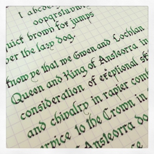
The hand is a fancied-up humanist script. It’s pretty and legible, even if my letterforms aren’t terribly consistent. I obviously need some more practice with it. Look at those Bs!
I reproduced the effect of the copperplate engraving with the much simpler technique of pen and ink drawing. It’s been a while since I’fe done any sort of hatching in my drawings, and I was pleasantly surprised at how quickly it came back to me.
Here we have Malcolm (as I jokingly named him on the FB page; his hat looks a bit like a Scots bonnet to me) completely finished. I’m pleased with he depth of shading I got with the hatching.
And Malcolm’s friend Kenneth, who has a fantastically developed sartorial sensibility.
All ready to head to the event and be given to a worthy fighter! Funny story: my friend Matteo actually won this; it was his first Kingdom-level championship. I’m so proud to have my work hanging on his wall.
Rene’s Red Doublet
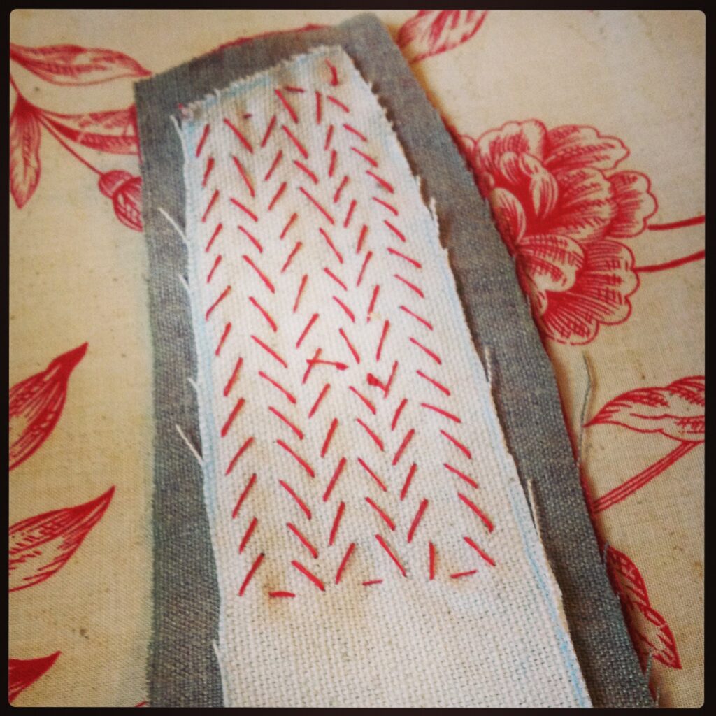
Just a couple shots of a new doublet in the works. Well, it was new when I was making it… In May. It’s finished now, but I wanted to show the in-progress shots first, especially the attempt at a pad-stitched collar. I’m pretty happy with the way it came out; it added a lot of stability to the finished product.
New Project
Elizabethan Elen
Queen’s Champion, May 2013
I’m getting better. I actually brought my camera this time. I’m trying to get better about actually taking pictures. Especially because my Mother’s Day present was a new 16 gig memory card for my camera. I’m heading out to a Scribal Symposium in June, and I wanted to make sure I had enough space for three days worth of pictures. Anyway, yeah, I took some pictures. Of friends:
And of Edmund and I (recognize the apron?):
And us and Poppet. I love how urchin-like she looks in this picture:
Some of our friends:
The babies even played nicely together:
The big kids didn’t hurt each other too badly:
There was jousting. The Knight of Flowers (any George RR Martin fans out there?) took the field:
I think most of the kids had this expression on their faces when I tried taking pictures:
Feast was delicious:
Even though my husband is incapable of making a serious face for the camera.
Tell you what, though. His doublet looked damn fine.
Early and Late period Cup covers
So, I’ve been a little silent lately. It wasn’t on purpose, I’ve just been working on a lot of stuff lately, and it’s sometimes hard for me to balance the things I like to do (this blog) and the things I’ve committed to doing (the things I’m going to be posting about this week). It’s not you, it’s me. Or rather, my non-existant time-management skills.
We had a big to-do this weekend. It was an SCA event called Queen’s champion. The rapier fighters (guys who fight with light metal swords, all Princess Bride style, instead of big rattan swords, in roughly the style of Braveheart) get together and compete to be the one who fights for the Queen’s honor during her reign. There’s a King’s champion, too, but they’re the rattan fighters, and don’t feature in this story. Usually, all that happens at a QC event is the fighting, but this time, they held an Arts and Sciences competition as well. The items that were put in would then be donated to the basket of gifts that the Royals hand out as largess during their reign.
I made two embroidered cup covers. Although they’re not strictly period, they’re a nice visual touch that can conceal a soda can, and keep bugs and leaves out of one’s drink. I made one early period, based on Anglo-Saxon brooches.
The other one is a later period design, with an Tudor Rose and an Ansteorran star, and the shading created by the use of blackwork fill patterns. I think they came out nicely. I’ve got one more cup cover, a ton of calligraphy, and pictures of the actual event coming up this week. And then, hopefully, we’ll be back to our regularly scheduled blogging.
Passimenterie
Roses Embroidery Pattern
Compass Rose Cup Cover
A while back, I got tired of getting leaves and bugs in my cup at SCA events and made myself a cup cover. In the same post, you’ll see that I started one for Nick, too, but I never liked it. The design is good, but the colors and progression I chose for it was, um, ill-advised. Not only that, but it was a Viking-era design, embroidered in a medieval style. Not at all what an Elizabethan courtier would use. So I elected to design him a new one.
I chose a hybrid between a compass rose (since Nick’s persona is a sea captain and privateer) and a Tudor Rose (a very Elizabethan motif). I used a few different blackwork fill designs to create light and dark areas, and the plain fabric (100% linen, but not even weave) for negative space. I used some brass beads and faux green pearls for corner weights, and a plain running stich to hem it. I’m much happier with this one.