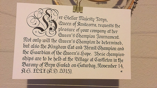
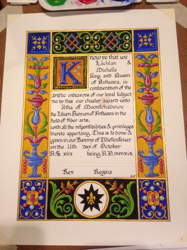
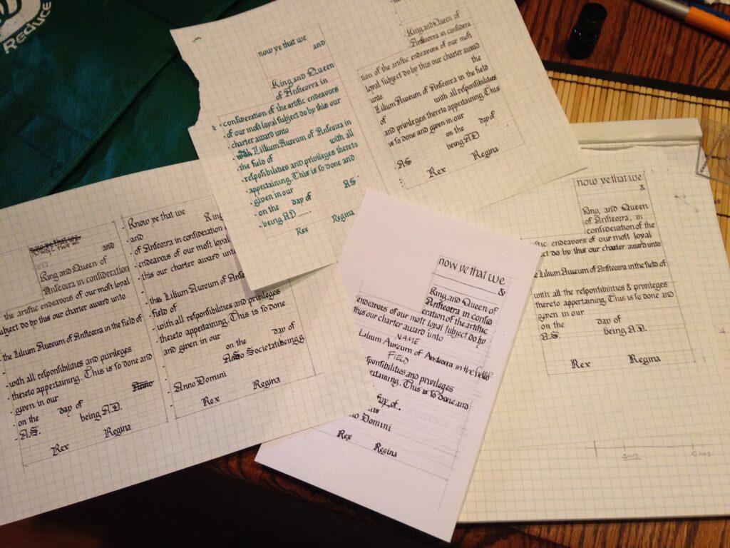
IN WHICH our intrepid recreatrix takes a step back, mulls some cider, dresses up, and creates an achievement of arms for her partner as a solstice gift.
It’s been a rough year. Enjoy this calm interlude and wonderful music.
IN WHICH our intrepid recreatrix takes a step back, mulls some cider, dresses up, and creates an achievement of arms for her partner as a solstice gift.
It’s been a rough year. Enjoy this calm interlude and wonderful music.
This past weekend was Kingdom Arts and Sciences. Ansteorra has a yearly (although the did do an extra one this year; I’m not sure if that will be the norm, or if they’ll scrap the idea of twice-yearly) competition to determine the premiere artisan of the kingdom. In addition, the top ten scoring entries (with a couple alternates) are asked to bring their work to Gulf War as pilgrims to compete against the opposing kingdom, Trimaris.
When I was first thinking about what I wanted to make for KAS, I thought about the knitted Sion reliquary that I had been planning on FOREVER. I wound off all the silk, dyed it, and knitted a test swatch… and realized that I’d have to knit ~1850 stitches A DAY for 30 days to get it finished. In addition to writing the documentation, moving, throwing the Poppet’s birthday party, and prepping for War. So, that was out.
Then Alden reminded me that we’d really already done all the research for his Achievement of Arms scroll (for which a blog post is in the works, I SWEAR) and that I could tweak the existing documentation that I’d written for a baronial A&S competition to suit Kingdom-level standards. I ended up re-writing it a few times, and entering the revamped docs into our local A&S competition, which is a week before KAS. That gives me time for last minute changes based on my scores.
The nerve wracking thing about KAS is that you get there in the morning, and you set up your display, and then you wait. And wait. And WAIT. I passed some of the time working on my gold work cuffs (I’ll get them done sooner or later!) and some of it shadow judging a lovely piece of stained glass with my Laurel.
Once that was done, it was just about time for court. They called my Laurel Amata in and recognized the service she’s done our Kingdom with a Sable Crane (the service equivalent of a Thistle). And then they announced the Gulf War pilgrims, of which I was one, along with several member of Bryn Gwlad. So proud of my Barony!
Photo by Mariana Garcia
Yeah.
To say that I was stunned is an understatement. I was glad to have Master Alden there to escort me into court because I was too shocked to move. I am so honored, and proud, and humbled, and surprised to be asked to join, that all my words desert me. Amata and I have started to talk about plans for vigils and elevations, and it all still feel like i’m planning it for someone else, because it hasn’t sunk in viscerally yet.
Photo by Martha Schreffler
Elen verch Phelip, Laurel Vigilant
It’s a new year! While I am usually overwhelmed by possibility and eager to start the new year’s projects, this past year has ended on a difficult note for me, personally. I am having a hard time being excited about 2016 and what it will bring. I want to take a minute or two to look back at my finished projects for 2015.
Embroidered Head Cloth for Dena: A quick and sweet little embroidery/handsewing project for a friend, with elements of her heraldry on the back.
Court Barony Scroll for Sabina: A tongue in cheek, fun scroll for a friend’s Court Barony. My first real scribal commission. The first time I’ve ever deliberately defaced my scribal work.
Prick and Pounce Tutorial: I’m counting this as a project because I feel strongly about the roll of tutorials and sharing knowledge in educating people. Still my favorite way to transfer patterns.
Rabbit’s Lion Scroll: First time really experimenting with pigments treated in a period manner, first (semi-successful) gilding on a scroll.
Badge Cup Cover: My heraldry passed, and now I want to put my badge on ALL THE THINGS. Starting with this cup cover, that attaches to my goblet stem so I don’t lose it.
Dragon Pouch Collaboration: A fun little thing I did with my friend Lia to sponsor a fighter in a tournament where the buy-in was an item made by an artisan (or two!).
Queen’s Champion Invitations: Last minute call to make pretty invites for an event.
Cantigas de Santa Maria Pouches (and part two): An artisan trade with a friend, based on two pouches from a medieval manuscript.
Cut and Thrust Championship Scroll: A kingdom-level award scroll based on a renaissance fencing manual plate.
These aren’t all the projects I’ve don’t this year, but they are all the ones I’ve blogged about.
I blogged about these red hose in progress, but I need to do a completed project post for them and the ginger version.
I made myself a beautiful Roman outfit.
The write up for this ridiculous scroll is coming. I promise. It may be two or three entries long. It was a monster.
Finally managed to fire this plate (third time’s the charm, right?) It lives on a shelf high up and away from danger.
Calligraphed a poem for a very dear friend.
Worked hard on learning to be a proper heraldic artist.
Wrote out the calligraphy for the invitations to our Baronial fall event.
Finished this monstrous endeavor. It ended up being shorter than I thought it needed to be initially, which made me cry, but it turned out okay in the end. Write up coming.
Made a 14th century frilled veil. That I kind of hate and want to remake.
Practiced the Japanese art of Kintsugi.
Made a pair of garters for my friend Cecilie.
Calligraphed this award, which is not for the SCA (but still looks amaze!)
All in all, it’s been a productive year. I think I’ve missed a couple things, actually. Next up will be discussion of some projects I’m hoping to accomplish this coming year, and some changes I’ll be making to the site. Happy New Year, everyone!
One of the things I believe in is the concept of noblesse oblige as it relates to the SCA and what I perceive to be my duties in it. With my awards and titles comes a responsibility to support my royalty, my kingdom, and my society, and to live up to those accolades. Which is a really self-important way to say that every reign (so about every six months), I try to volunteer my services to make at least one scroll for the kingdom. This time around, it was the Cut and Thrust Championship scroll.
A friend suggested I look at the fencing manual of Achille Marozzo, the Opera Nova. Marozzo was an Italian Master who lived in the latter half of the 1400s, and into the first half of the 1500s. I liked the stark, graphic nature of the copperplate engravings; they’re so different from the illuminations I normally do. I found one plate that caught my eye and decided to run with it.
I penciled in the page ditches and figures, with general areas of shadow delineated, and then made the guidelines for the text.
The hand is a fancied-up humanist script. It’s pretty and legible, even if my letterforms aren’t terribly consistent. I obviously need some more practice with it. Look at those Bs!
I reproduced the effect of the copperplate engraving with the much simpler technique of pen and ink drawing. It’s been a while since I’fe done any sort of hatching in my drawings, and I was pleasantly surprised at how quickly it came back to me.
Here we have Malcolm (as I jokingly named him on the FB page; his hat looks a bit like a Scots bonnet to me) completely finished. I’m pleased with he depth of shading I got with the hatching.
And Malcolm’s friend Kenneth, who has a fantastically developed sartorial sensibility.
All ready to head to the event and be given to a worthy fighter! Funny story: my friend Matteo actually won this; it was his first Kingdom-level championship. I’m so proud to have my work hanging on his wall.
Sometimes life throws a curveball. Not to me, this time, but to the lady who was meant to make the invitations to our most recent Queen’s Champion event. The steward of the event, my sweet friend Marie, texted me to ask if there was any way I could make invitations in the four days before they needed to go out. So I sat down at my wonderfully medieval computer and whipped up a calligraphy template (with decorative cadel!) in photoshop, and used it as a guide for the final piece. I think it came out well, for a last-minute day’s work.
As you may have noticed, I do some scribal stuff. A little bit of calligraphy and illumination. Sometimes. I may also have a ridiculous collection of inks. Remember these?
Yeah, there’s more now. I have a problem, really.
One of the companies I buy from is a very small organization called Scribal Workshop. I met Lucas, the owner, at his booth at Sherwood Renaissance Festival a couple years ago. He was dressed as a monk, with full tonsure and everything. We had a wonderful conversation about inks and pigments and illumination and I took one of his cards.
About a year later, Ansteorra hosted the Known World Heraldic and Scribal Symposium (KWHSS, for slightly tongue-tying short) in San Antonio. I knew that Lucas was local-ish, and I sent him an email saying he might consider merchanting there. It was a whole symposium full of his people! To my delight, he did and we also ended up forming a friendship along the way. I own several products of his: a lead plummet, four different kinds of ink, and six pigments.
The plummet is basically a sharpened bit of lead-tin that makes pale pencil-like marks on paper and vellum. I use it for marking calligraphy guide lines and sketching out basic lines for painting. The plummet is made from one of Cenini’s recipes, and does contain lead. I am very careful about having it out around Poppet, and making sure I wash my hands thoroughly after using it.
It’s not very big; about 3″ long, but isn’t as soft as a #2 pencil. It’ll last me a good while.
The guidelines there were made by the plummet. Next up are brazilwood and buckthorn inks. The brazilwood is a very beautiful pinkish-red translucent ink. It was used mainly for making ruling lines. I’ve found that I have to be careful how I use it. It needs a very clean nib or quill. Any iron gall residue will result in a darkening of the ink to a very pretty (but undesirable) purple color. The buckthorn ink is a translucent yellow-green ink with LOTS of chasing. It was used as an enhancer for green pigment, and later as a pigment itself.
The walnut ink is from a slightly later-period recipe than the medieval inks; it’s a Colonial era recipe. It has a lot of shading as well, and a lovely brown color. The iron gall is what I use is most of my scroll work. It’s a violet shaded grey ink that turns black on the paper as it oxidizes. It’s hard to achieve an iron gall ink that will remain stable over a long period of time, but Lucas’ experience with chemistry means that his inks are all pH balanced and stable.
The six pigments I got from him came in seashells, just like a medieval palette. They come in basic earth colors, sap green (incidentally, from the same buckthorn berries as the ink), yellow and red ochres, cerulean blue, black and white. The sap green is really only good for shading, as no matter how thick I paint it, it remains transparent, But the rest can be treated the same way as modern gouache.
Lucas also offers other scribal items as well: wax tablets with wooden or metal styli, scribes’ pen-knives, pre-cut quills, and paper scrolls on his Etsy shop.
Hey guys! I have this scroll I did, but the person who commissioned it (Her Majesty Michelle) asked me to keep it under wraps until it was finished and given. But now that it has been, I can talk about it! The person in question has a Roman persona, and is often called Rabbit. I wanted to incorporate both of those things into his scroll.
I started off looking at pediments and tabernacle frames. Technically, the one I used for the most inspiration is a Renaissance creation, but it adheres to classical lines, so I went with it. I also looked at mosaic designs and repeating motifs from Pompeii and other Roman sites to add interest to the columns and pediment. I also found some interesting examples of Roman rabbits, and of course, the award badge had to go in there. too. I sketched out my design on graph paper, drawing in one of each motif, since they will get mirrored in the final design, and adding in a branch of Laurel leaves to reference his peerage.
I traced out the text box on another sheet of graph paper and played around with nib size and line spacing until I got it right. This hand is based on the Roman Rustic Capital alphabet in Marc Drogin’s book, although some of the line height and spacing was changed both to make it easier for me to write and to look more like the period examples shown. It only took me two tries to get it right!
I did somehow manage to get my initial draft off by an inch (the scroll is on 9×12 Fabriano hot press watercolor paper, but my draft was only 9×11), so the scroll is an inch longer than I’d planned it to be. It changed the proportions a bit, but gave me enough room to add in that line in the middle margin that I didn’t have room for in the draft.
Next up: gilding. I used miniatum as the substrate, and patent rather than loose leaf gold. Patent means that it comes attached to a piece of tissue paper, so you’re not fighting with tiny pieces of tissue thin gold that falls apart with every breath you accidentally blow on it. After the gold is finished, time for painting!
Rabbit is a skilled artisan (there’s a reason they made him a laurel!) and scribe. I wanted to up my game for this scroll, so I used the period pigments that I have been studiously ignoring for the last year. It’s part of my goal this year to work more with period materials and techniques, and I figured: why not start here?
About halfway through laying the flat colors. The paints I used were from Scribal Workshop and Griffon Dyeworks: ultramarine blue, cadmium red (don’t lick your paintbrush!), viridian green, and black. I also used a gold bronze-powder paint to add the dots at the very end.
And, finished. I didn’t do any shading at all in the flat areas; I liked the way they looked with flat, graphic colors. The point of the colored areas is to offset and highlight the gold.
Detail shots: You can see how I didn’t manage to get the miniatum 100% smooth under the gold leaf. That’s something I need to work on, and I wonder (since I was trying to go flat gilding as opposed to raised) if I should have used garlic juice instead. But I thought the miniatum would stick better. Next time I’ll thin it out a bit before laying it, and see if that helps the smoothness.
Words. I wasn’t terribly precious about line breaks, preferring to keep a nice full wall of text. Romans didn’t care particularly much about having line breaks in awkward parts of words anyway. My friend Cecilie told me I should have omitted vowels the way they did too, but I said I wanted viewers to be able to actually read it if they tried.
Loving the clean lines and bold colors.
It was really hard to try to photograph the shine of the gold. Either it got blown out completely, like this:
Or the rest of the picture was terribly dark, like this. Suffice it to say: it’s SHINY. Design to finish, this scroll took about 15 hours.
I was commissioned by a friend to make, in secret, a Court Barony scroll for his wife, Sabina. He had some very specific ideas for what he wanted it to look like. He wanted a very long scroll, that could be unfolded (and unfolded and unfolded). He wanted a genealogy, going back to the line’s founder, and ending in Sabina. Her persona is Italian, so he wanted a very Borgia-like family, plagued by misfortune and calamity (some of it wrought by other family members).
Looking around, I found a manuscript, the Genealogy of Christ by Peter of Poitiers (ca. 1130-1205, which is way early for a Venetian courtesan, but who’s telling this story?!) that we both liked the bold, graphic nature of.
I started off by measuring the longest sheet of paper I had, Somerset printmaking paper. It turned out to be 30″ long. I settled on making the scroll 11″ wide, to make it look even longer proportionally. I taped two pieces of graph paper together and marked off 1.5″ margins all around. Then I marked out the central line and circles where I thought they’d look pleasing. It should be noted that this is not meant to be an accurate family tree, even for her persona. It’s meant to be a prop that looks good, and is accidentally a legal document.
The design was inked to allow for easier tracing via lightbox.
Using my patented Giant Natural Lightbox technique (ie: taping the papers to my french door and tracing the lines), I transferred my design onto the final paper. You may not that I didn’t do any “wet-fits,” or making sure that the calligraphy would fit into the allotted space. If you look at the original manuscript, the text is rather jammed in around the lineage. I wanted the same look. I did, however, leave what I was pretty sure would be enough space at the bottom for the actual award text.
I inked the initial lines in red. Originally I used brazilwood, but I think perhaps some remaining iron-gall ink in my nib oxidized with it and instead of a lovely light pinkish-red, it darkens to a pretty (but incorrect) purple. Instead, I used a red india ink.
You can see my first serious screw up. I traced the line with my ruler upside down and the ink bled underneath it. I love my first screw-up of a project. It keeps me from being too precious about the rest of it.
And for a mistake, it’s easily fixed by scraping the top layer of the paper off with my scalpel and burnishing the fuzzy spot that’s left. The green inner circles were drawn with watered down gouache, and the faces were sketched in (very loosely, this is not a time for perfectionism) and then inked with my favorite Scribal Workshop Iron Gall ink.
Portraits are all finished! That’s Sabina at the bottom right. It kinda looks like her, too.
Side by side comparisons of the design paper and the in-progress scroll. All the painting is finished there; I’m particularly proud of the central stripe. It’s so lovely and graphic.
A close-up of the portraits. They got a small bit of shading after this picture; I thought they looked a bit too flat, even for this style.
Names and causes of death filled in. Like any good Venetian family, lots of poison, lots of war, lots of killing each other in underhanded ways. Even one “defenestration,” which is being thrown out a window.
And with the text and marginalia written in. The actual award text is in English, while the marginalia is in Latin. I wanted the writing to be there, but not to detract from the actual award. Some of the latin bits are Bible verses on the importance of a loving family, and some are notes about how horrified the poor scribes are about how “unlucky” this family has been.
If you notice, the last seven heirs died in a fire (started as they attempted to kill each other to obtain the estate). This family tree and the coronet she was given were the only surviving artifacts. Part of my commission was to make sure that the scroll looked like it had been rescued from a fire. I aged the paper with various washes of watercolor, and added some bloody handprints and splatters. I also painted the paws of my more tolerant cat and had him walk over the back of the scroll. He was very patient and only cried a little bit when I washed the excess paint off him.
I added some wine rings on th front (such careless scribes!) and some more blood splatters and sooty handprints. I was going to make those in charcoal, but it wasn’t wanting to cooperate, so I just used dark grey gouache instead. Then I took a candle and burned the edges, and made soot marks.
The one place I deliberately (mostly) avoided was the legal text. I didn’t want that getting smudged or burned beyond recognition. The hole in th middle accidentally forms a nice portrait window if you fold it over right, too.
The scroll all folded up. I actually have some hanging seals to attach, but I thought it’d be easier to do it after the hoopla in court was done.
A clean version of the scroll text, before clean-up. I misspelled her name horribly, but it’s a relatively easy fix.
Photo by Katy Thompson. Used with permission.
And Her Excellency Sabina with her scroll!
Commence Part Two! The first thing I did was to fill in the rest of the calligraphy. I tend to be pretty confident when it comes to my calligraphy (I have a tendency to give one of my mentors heart attacks because when I work with other illuminators, I’ll do the calligraphy after theyre finished painting instead of before they start), but there’s no use tempting fate.
I painted the borders gold with some gold watercolor I’ve had laying around for a while. Or maybe it was the Winsor & Newton gold gouache? I can’t remember. I wanted something shiny in there. I also chose black and gold for the backgrounds of the biggest areas to better represent Ansteorra. The blue was because I thought it looked rich and opulent. You may notice that there’s a big ocher blotch in the middle of the calligraphy. Yeah. That’s what happens when you try to paint during an allergy attack.
The background flats are all finished here, and I’ve started filling in some of the foreground flats. I’ve blotted away the excess paint in the mistake, and dabbed it with a little water to pick up what I can of it. Then I’ll let it dry over night and then scrape off what I can of the paint that’s left with a scalpel blade (seriously, scribes: scalpels. Cheaper than exactos and sharper, too).
The foreground flats are all finished. You can see how strikingly graphic and beautiful this design is when painted with just flats. It was a huge relief to me to see that, since it was a consideration in my design. I’ve tried to not paint over the lines, but not made a huge deal of it, since there were no outlines in the inspiration piece. I’ve scraped away most of the yellow paint in the mistake, but it’s not completely gone. I’ll have to paint over it with white in order to fix it.
Starting in on the shading. I suppose this is as good a time as any to talk about paint. I use gouache, an opaque watercolor consistig of pigment (the color), gum arabic (the binder that holds the pigment together), and chalk, or other inert substance (to make to opaque). I tend to use artist grade paints, a legacy of my time in art school, but a mixture of brands. I could probably write up a whole post on the paints I use, with comparisons. In fact, I probably should.
And the majority of the shading finished. For the most part, it’s achieved by hatching and cross-hatching a highlight color, either white or yellow, on top of the base color. I used a teeny-tiny round brush (3/0 or 4/0 I think) to do the shading.
A closer look at the left side of the scroll. There will be a drop-shadow added behind the ornaments, too, to heighten the illusion of dimentionsality.
Finished scroll! I’m really pleased with the way that it came together, although I think the filigree work around the versal was a little haphazard. But I know that Asha loved her scroll (her mum told me so!) and that’s really all that matters to me.
Not too long ago, at our local Larurel’s Prize Tourney (I have picture of that coming soon), I was approached and asked to design a charter for a new children’s A&S award. For those of you unfamiliar, a charter is a scroll that has spaces left blank for the recipient’s name, the date, royal signatures, etc. They also usually have linework designs on them, so each can be painted individually. I’ve never made a charter design before, and I was thrilled to be asked. It turns out that charter-designing is pretty different from one-off scroll-design.
First, I needed some inspiration. It was a tough decision, actually. I needed a design (a later period design, at the request of Their Majesties) that was complex enough to stand on its own if a very beginning painter just used flat colors, and something that would give more advanced painters the chance to go to town with shading if they wanted to. In the end I went with Francesco Marmitta’s Rangoni Bentivoglio Book of Hours, an Italian work from around 1500. It’s currently housed at the Walters Art Museum in Baltimore.
Not shown: taking ideas from several leaves of the Book and sketching them out on graph paper to get the proportions right within my space limitation. I then brought the images into photoshop to get everything the way I wanted and mirrored without a whole ton of problems. Then I traced the image onto tracing paper so I could easily transfer it to the final working paper.
I knew I wanted to make sure the hand was consistent with the illumination style, so I went through all the pages I had and pulled out several letters that appeared on them. To fill in the gaps, I looked through Stan Knight’s amazing book Historical Scripts from Classical Times to the Renaissnce for similar times and places.
I did a couple of calligraphy drafts…
And then a couple more. The problem with creating a charter is that you have to leave space enough for a hugely long name (because someone might have picked Tangwystyl Fairehayvenn of Llanleystocke as a name, rather than John York), a hugely long area of expertise (again, calligraphy and illumination, as opposed to gaming) and placename. Trying to make sure that each of those had enough space, as well as the date, years, and signatures was difficult. I went through six different drafts, instead of my normal two or three. At least it gave me the time to practice my hand?
I use a small lightbox (9×13 or so) to stransfer small scrolls like this one. For larger scrolls, I tape the paper to my french doors. Thank goodness for th Texas sun. A friend of mine is actually going to make me a bigger light table, large enough to do peerage-sized scrolls. He made his wife one, and I’m intensely jealous. I trace out all my linework with 5mm mechanical pencil, in 2H hardness. I like the darkness of the line; I can see it well enough to ink, but it’s still easy to erase after, and the 5mm makes a consistently fine line on the paper.
Incidentally, I’m using Fabriano hot press watercolor paper here. It’s smooth and delicious to write and draw on, the ink I’m using (Scribal Arts Iron Gall ink for calligraphy, Platinum carbon blank ink in a LAMY fountain pen with extra-fine nib for the artwork) doesn’t bleed or feather, and it holds up to abuse (lots of wet paint, and scraping and burnishing for corrections) well.
Here you can see the pencils are all finished, and I’ve calligraphed the charter text. I’ll go back in later and fill in the premiere recipient’s information later.
Nearly finished inking. I’ve tried to reduce the lovely design into linework that evokes the delicate nature of the original without being too intimidating to paint.
And the charter is finished. At this point, I’ll wait for the ink to dry overnight to avoid any smearing of lines when I go back and erase the pencil guides. Then I’ll scan it into photoshop and correct any little tiny errors before printing out a nice bold master copy for our Star Signet (the scribe in charge of kingdom charters).
In the next installment, we’ll see how this goes from charter to finished award.