Commence Part Two! The first thing I did was to fill in the rest of the calligraphy. I tend to be pretty confident when it comes to my calligraphy (I have a tendency to give one of my mentors heart attacks because when I work with other illuminators, I’ll do the calligraphy after theyre finished painting instead of before they start), but there’s no use tempting fate.
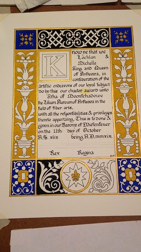
I painted the borders gold with some gold watercolor I’ve had laying around for a while. Or maybe it was the Winsor & Newton gold gouache? I can’t remember. I wanted something shiny in there. I also chose black and gold for the backgrounds of the biggest areas to better represent Ansteorra. The blue was because I thought it looked rich and opulent. You may notice that there’s a big ocher blotch in the middle of the calligraphy. Yeah. That’s what happens when you try to paint during an allergy attack.
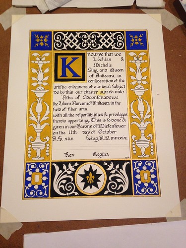
The background flats are all finished here, and I’ve started filling in some of the foreground flats. I’ve blotted away the excess paint in the mistake, and dabbed it with a little water to pick up what I can of it. Then I’ll let it dry over night and then scrape off what I can of the paint that’s left with a scalpel blade (seriously, scribes: scalpels. Cheaper than exactos and sharper, too).
The foreground flats are all finished. You can see how strikingly graphic and beautiful this design is when painted with just flats. It was a huge relief to me to see that, since it was a consideration in my design. I’ve tried to not paint over the lines, but not made a huge deal of it, since there were no outlines in the inspiration piece. I’ve scraped away most of the yellow paint in the mistake, but it’s not completely gone. I’ll have to paint over it with white in order to fix it.
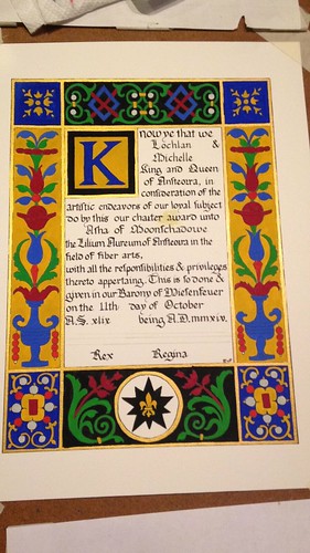
Starting in on the shading. I suppose this is as good a time as any to talk about paint. I use gouache, an opaque watercolor consistig of pigment (the color), gum arabic (the binder that holds the pigment together), and chalk, or other inert substance (to make to opaque). I tend to use artist grade paints, a legacy of my time in art school, but a mixture of brands. I could probably write up a whole post on the paints I use, with comparisons. In fact, I probably should.
And the majority of the shading finished. For the most part, it’s achieved by hatching and cross-hatching a highlight color, either white or yellow, on top of the base color. I used a teeny-tiny round brush (3/0 or 4/0 I think) to do the shading.
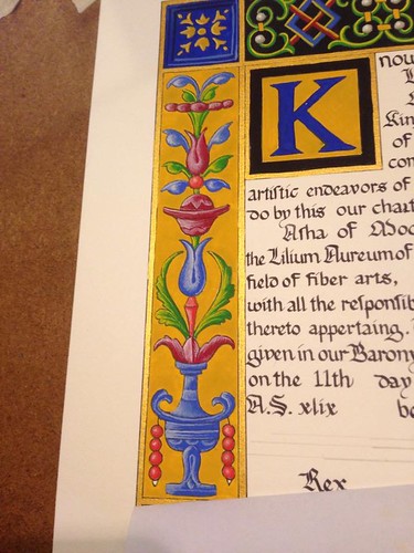
A closer look at the left side of the scroll. There will be a drop-shadow added behind the ornaments, too, to heighten the illusion of dimentionsality.
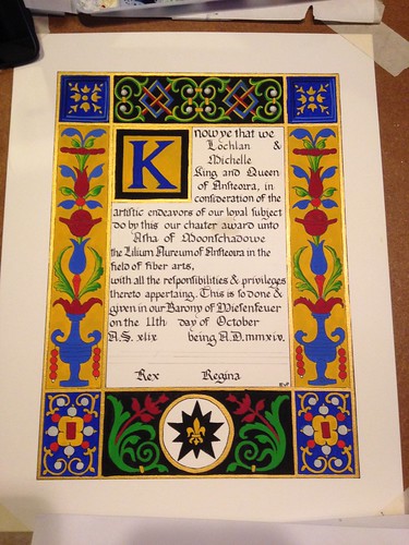
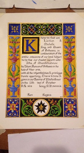
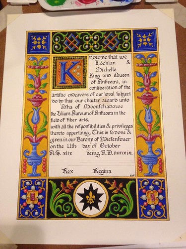
Finished scroll! I’m really pleased with the way that it came together, although I think the filigree work around the versal was a little haphazard. But I know that Asha loved her scroll (her mum told me so!) and that’s really all that matters to me.
