Tutorial: Prick and Pounce

I’ve had a lot of people interested in how I transfer my patterns to fabric for embroidery. I use a technique (one that’s completely period, actually!) called pricking and pouncing. Basically, you poke holes in paper to make a design template, then shake colored powder on the design. When you lift the template, it gives you a series of dots to connect, and you can reuse the template later.

Prick and pounce tutorial, for Opuselenae.com

First we start by gathering our materials. I have a whole kit there, which goes to show how often I do this. I’m going to be making a cup cover with my newly registered badge on it. I have a template for the design made already, so I’ll be demonstrating how to prick a design with something else.

Prick and pounce tutorial for opuselenae.com

To make my templates, I use plain printer paper. It’s sturdy enough to hold up to the pouncing, and it’s easy to get designs on there. I’ve also used tracing paper and that works fine as well. My tiny awl is made from a relatively large sewing needle I glued into a hole I drilled in a peg I got at a local craft store. My Laurel made a handle from Fimo clay. Whatever’s clever, you just don’t want to be gripping a tiny-diameter thing for that long.

Prick and pounce tutorial for opuselenae.com

To be able to poke holes deeply enough, I like to rest the template on something with some thickness that won’t be damaged by a needle poking at it repeatedly. I have a pretty handwoven piece of cloth that I sometimes use, but mostly, I grab a couch cushion and use that instead.
Prick and pounce tutorial for opuselenae.com

Make sure that you poke the needle far enouh in tha it makes a fair sized hole. If the pricks are too small, the powder won’t fall through and the design won’t show up on the ground. Prick and pounce tutorial for opuselenae.com

Here I’ve pricked a tiny part of this design to illustrate a couple of things. First, you want to make sure that you make a hole in every corner of the design. You want to mark where the lines change directions to have the most accurate design possible. Second, around tight curves, make the dots closer together. This will give you, again, the most accurate line you can get. Three, on shallower curves, or straight lines, you can space the dots out further, as I did along the outer circle there. You don’t need as many points to act as a guideline in that case. Prick and pounce tutorial, for Opuselenae.com

I folded my material in quarters to find the center, which I marked with a disappearing marker. Not strictly necessary in this case, but next time the embroidery night might not cover the dot. Better safe than sorry.

Prick and pounce tutorial, for Opuselenae.com

The template goes in the middle there, and I hold it down with one hand while I pounce with the other.

Prick and pounce tutorial, for Opuselenae.com

Pouncing supplies. I got charcoal powder from an art supply store. Graphite powder works well, too, but isn’t period. For dark colored fabrics, I use pool chalk, which I found at a sporting goods store. All of these are also available at Amazon, too. The pouncer is a wooden knob with one of those carpet dots you put on the bottoms of chairs to protect floors stuck on it. That stuff and the little plastic containers for the powders were obtained from a craft store.

Prick and pounce tutorial, for Opuselenae.com

Get a little powder on the pouncer and kind of tap it against the template, or rub it in small circles over the design. You want to make sure you hit the whole thing, while holding the paper still so you don’t get a fuzzy image because it’s shifted.

Prick and pounce tutorial, for Opuselenae.com

When you take up the template, you should have a pretty clear design. The powder will rub off pretty easily, though, so you’ll want to connect the dots before stitching. I use a Micron 01 pen. It gives me a nice thin line, and is archival so won’t bleed.  Prick and pounce tutorial, for Opuselenae.com

Keep your template at hand for reference; especially for the fiddly bits. When you’re done connecting the dots, shake the powder off. I usually whack the material against my leg a couple of times, as if I was beating dust out of a rug. And when you’re done, voila!

Prick and pounce tutorial, for Opuselenae.com

Ready to start embroidering!

Hummingbird

For dark cloth, I use the white chalk for pounce, and connect the dots with either white gel pen, or thinned out white acrylic paint and a tiny brush.

Amata's border design

The technique being used to transfer a design to a piece of pottery before being painted. Please let me know if this has been useful, or if I need to clarify ayting. Good luck!


Court Barony Scroll for Sabina

I was commissioned by a friend to make, in secret, a Court Barony scroll for his wife, Sabina. He had some very specific ideas for what he wanted it to look like. He wanted a very long scroll, that could be unfolded (and unfolded and unfolded). He wanted a genealogy, going back to the line’s founder, and ending in Sabina. Her persona is Italian, so he wanted a very Borgia-like family, plagued by misfortune and calamity (some of it wrought by other family members).

f7e47262267654c87e8c8f13c267c49f

Looking around, I found a manuscript, the Genealogy of Christ by Peter of Poitiers (ca. 1130-1205, which is way early for a Venetian courtesan, but who’s telling this story?!) that we both liked the bold, graphic nature of.

Sabina's Court Barony Scroll

I started off by measuring the longest sheet of paper I had, Somerset printmaking paper. It turned out to be 30″ long. I settled on making the scroll 11″ wide, to make it look even longer proportionally. I taped two pieces of graph paper together and marked off 1.5″ margins all around. Then I marked out the central line and circles where I thought they’d look pleasing. It should be noted that this is not meant to be an accurate family tree, even for her persona. It’s meant to be a prop that looks good, and is accidentally a legal document.

Sabina's Court Barony Scroll

The design was inked to allow for easier tracing via lightbox.

Sabina's Court Barony Scroll

Using my patented Giant Natural Lightbox technique (ie: taping the papers to my french door and tracing the lines), I transferred my design onto the final paper. You may not that I didn’t do any “wet-fits,” or making sure that the calligraphy would fit into the allotted space. If you look at the original manuscript, the text is rather jammed in around the lineage. I wanted the same look. I did, however, leave what I was pretty sure would be enough space at the bottom for the actual award text.

Sabina's Court Barony Scroll

I inked the initial lines in red. Originally I used brazilwood, but I think perhaps some remaining iron-gall ink in my nib oxidized with it and instead of a lovely light pinkish-red, it darkens to a pretty (but incorrect) purple. Instead, I used a red india ink.

Sabina's Court Barony Scroll

You can see my first serious screw up. I traced the line with my ruler upside down and the ink bled underneath it. I love my first screw-up of a project. It keeps me from being too precious about the rest of it.

Sabina's Court Barony Scroll

And for a mistake, it’s easily fixed by scraping the top layer of the paper off with my scalpel and burnishing the fuzzy spot that’s left. The green inner circles were drawn with watered down gouache, and the faces were sketched in (very loosely, this is not a time for perfectionism) and then inked with my favorite Scribal Workshop Iron Gall ink.

Sabina's Court Barony Scroll

Portraits are all finished! That’s Sabina at the bottom right. It kinda looks like her, too.

Sabina's Court Barony Scroll

Side by side comparisons of the design paper and the in-progress scroll. All the painting is finished there; I’m particularly proud of the central stripe. It’s so lovely and graphic.  Sabina's Court Barony Scroll

A close-up of the portraits. They got a small bit of shading after this picture; I thought they looked a bit too flat, even for this style.

Sabina's Court Barony Scroll

Names and causes of death filled in. Like any good Venetian family, lots of poison, lots of war, lots of killing each other in underhanded ways. Even one “defenestration,” which is being thrown out a window. Sabina's Court Barony Scroll

And with the text and marginalia written in. The actual award text is in English, while the marginalia is in Latin. I wanted the writing to be there, but not to detract from the actual award. Some of the latin bits are Bible verses on the importance of a loving family, and some are notes about how horrified the poor scribes are about how “unlucky” this family has been.  Sabina's Court Barony Scroll

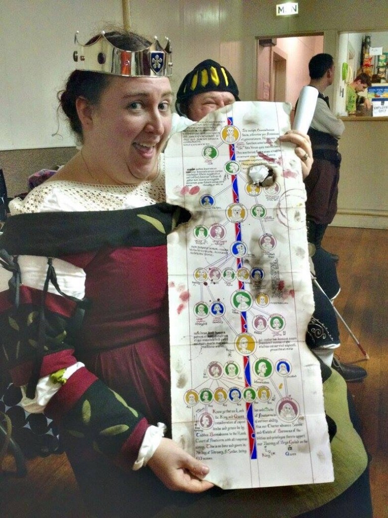
If you notice, the last seven heirs died in a fire (started as they attempted to kill each other to obtain the estate). This family tree and the coronet she was given were the only surviving artifacts. Part of my commission was to make sure that the scroll looked like it had been rescued from a fire. I aged the paper with various washes of watercolor, and added some bloody handprints and splatters. I also painted the paws of my more tolerant cat and had him walk over the back of the scroll. He was very patient and only cried a little bit when I washed the excess paint off him.
Sabina's Court Barony Scroll

I added some wine rings on th front (such careless scribes!) and some more blood splatters and sooty handprints. I was going to make those in charcoal, but it wasn’t wanting to cooperate, so I just used dark grey gouache instead. Then I took a candle and burned the edges, and made soot marks.
Sabina's Court Barony Scroll

The one place I deliberately (mostly) avoided was the legal text. I didn’t want that getting smudged or burned beyond recognition. The hole in th middle accidentally forms a nice portrait window if you fold it over right, too.  Sabina's Court Barony Scroll The scroll all folded up. I actually have some hanging seals to attach, but I thought it’d be easier to do it after the hoopla in court was done. 
Sabina's Court Barony Scroll A clean version of the scroll text, before clean-up. I misspelled her name horribly, but it’s a relatively easy fix.

Photo by Katy Thompson. Used with permission. Photo by Katy Thompson. Used with permission.

And Her Excellency Sabina with her scroll!