In Progress: Bliaut Collar

Have I really not blogged about this beyond showing some samples? I know I’ve talked about it a BUNCH on the Facebook page (good reason to follow me there; I tend to post small updates on things that don’t make it to the blog as finished posts). It’s about time I did, then, since I’ve recently taken it up again.

When I made my twelfth century bliaut, I knew I wanted it to have a beautifully embroidered collar, a la Racaire’s lovely work. I did some research into pretty scroll-ish vines and found the tails of the mitre of Thomas a Beckett. I picked one singular motif (since they change in size from top to bottom) and played around with it in Photoshop until I had a template I liked. I printed it out (it’s so much bigger than I thought it would be!), and followed my prick-and-pounce technique to transfer the design to the red-orange linen I used on the lining of the bliaut.

Bliaut Collar Progress

Remember back in the day, when I bought these threads? I had it as my plan to use the green and purple for the embroidery on this collar. The lime green and red-orange is not an intuitive choice to the modern eye, but the medieval aesthetic is FULL of crazy color combinations. I started off using split stitch on the fill. I didn’t like how the clover-leaf finials were coming out, though, so I cut them out and redid that one there.
Bliaut Collar Progress

Here you can see the new clover finials, and the progress. I added in some additional ink lines in the middle of the Y-junctures of the vines, to help guide my stitch direction, which was a really handy thing to do.  Bliaut Collar Progress One side of the green all finished. It’s sitting at about 16:30 hours of work in that picture. 
Bliaut Collar Progress

I wasn’t sure exactly what I wanted to do with the border, so I bought a darker version of the green fill. At least, it looked like the same color, but when I stitched it on to test it, the border green looked SO much more yellow. So, that’s not gonna work. I cut it out and decided to go with the purple instead. Bliaut Collar Progress Finished up the stem-stitch outline on the vine here. I thought about doing the border in stem stitch too, but it actually looked better in split stitch. I’m still debating what to do in the center of the border squares, but I have a bit of time before I have to decide. I could do a satin stitch square, or a small square outline, a pearl in the center, or I could just leave it as it is. I’ll figure it out at the very end.
Bliaut Collar Progress About halfway done with the second side green stitching. Aaand, that’s where it sits for AGES. I got busy with other projects and put it on the back burner.
Bliaut Collar Progress

But I missed working on it, so I decided to devote at least ten minutes of embroidery time on it per day. I think I’ve worked more on it the last three days than I have in the last six months. I don’t think I’ve stitched less than an hour on it since I started working again.
Finished up the last green spiral where the embroidery sits now. Threaded up the needle to finish up the purple so I can advance it to the next bit.

This is where it is right now. I’m almost done with the purple, and then I’ll advance it to the next, clear section to keep working. It’s gonna be daunting, I think, to see a whole new blank space (and to know that I probably have another three “blank” sections to go, not counting the sleeve sections, before this is finished), but I will persevere in my ten minutes a day resolution until it’s finished.  Bliaut neckline. 45:58 hours. Http://opuselenae.com Time invested so far: 45:58 hours.

Rabbit’s Lion Scroll

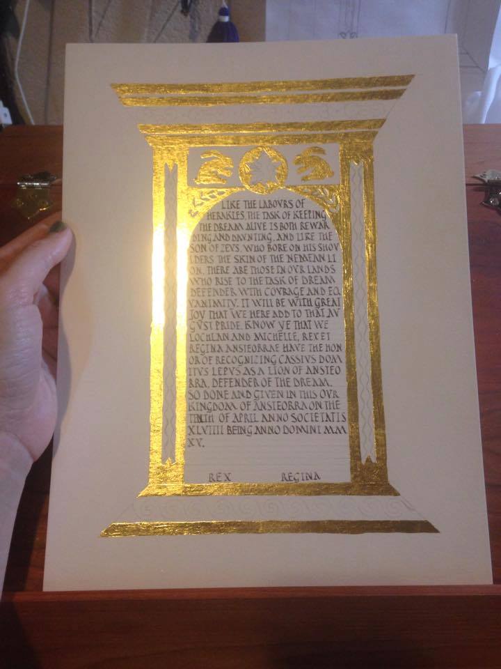
Hey guys! I have this scroll I did, but the person who commissioned it (Her Majesty Michelle) asked me to keep it under wraps until it was finished and given. But now that it has been, I can talk about it! The person in question has a Roman persona, and is often called Rabbit. I wanted to incorporate both of those things into his scroll.

I started off looking at pediments and tabernacle frames. Technically, the one I used for the most inspiration is a Renaissance creation, but it adheres to classical lines, so I went with it. I also looked at mosaic designs and repeating motifs from Pompeii and other Roman sites to add interest to the columns and pediment. I also found some interesting examples of Roman rabbits, and of course, the award badge had to go in there. too. I sketched out my design on graph paper, drawing in one of each motif, since they will get mirrored in the final design, and adding in a branch of Laurel leaves to reference his peerage.
DSC05311

I traced out the text box on another sheet of graph paper and played around with nib size and line spacing until I got it right. This hand is based on the Roman Rustic Capital alphabet in Marc Drogin’s book, although some of the line height and spacing was changed both to make it easier for me to write and to look more like the period examples shown. It only took me two tries to get it right! DSC05307

I did somehow manage to get my initial draft off by an inch (the scroll is on 9×12 Fabriano hot press watercolor paper, but my draft was only 9×11), so the scroll is an inch longer than I’d planned it to be. It changed the proportions a bit, but gave me enough room to add in that line in the middle margin that I didn’t have room for in the draft.  Rabbit's Lion Scroll

Next up: gilding. I used miniatum as the substrate, and patent rather than loose leaf gold. Patent means that it comes attached to a piece of tissue paper, so you’re not fighting with tiny pieces of tissue thin gold that falls apart with every breath you accidentally blow on it. After the gold is finished, time for painting!
Rabbit's Lion Scroll

Rabbit is a skilled artisan (there’s a reason they made him a laurel!) and scribe. I wanted to up my game for this scroll, so I used the period pigments that I have been studiously ignoring for the last year. It’s part of my goal this year to work more with period materials and techniques, and I figured: why not start here? Lion scroll progress.

About halfway through laying the flat colors. The paints I used were from Scribal Workshop and Griffon Dyeworks: ultramarine blue, cadmium red (don’t lick your paintbrush!), viridian green, and black. I also used a gold bronze-powder paint to add the dots at the very end. 
Lion scroll progress.

And, finished. I didn’t do any shading at all in the flat areas; I liked the way they looked with flat, graphic colors. The point of the colored areas is to offset and highlight the gold.

Rabbit's Lion Scroll

Detail shots: You can see how I didn’t manage to get the miniatum 100% smooth under the gold leaf. That’s something I need to work on, and I wonder (since I was trying to go flat gilding as opposed to raised) if I should have used garlic juice instead. But I thought the miniatum would stick better. Next time I’ll thin it out a bit before laying it, and see if that helps the smoothness.
Rabbit's Lion Scroll

Words. I wasn’t terribly precious about line breaks, preferring to keep a nice full wall of text. Romans didn’t care particularly much about having line breaks in awkward parts of words anyway. My friend Cecilie told me I should have omitted vowels the way they did too, but I said I wanted viewers to be able to actually read it if they tried.

Rabbit's Lion Scroll

Loving the clean lines and bold colors.  Rabbit's Lion Scroll

It was really hard to try to photograph the shine of the gold. Either it got blown out completely, like this: Rabbit's Lion Scroll

Or the rest of the picture was terribly dark, like this. Suffice it to say: it’s SHINY. Design to finish, this scroll took about 15 hours. Rabbit's Lion Scroll