Completed: Cut and Thrust Scroll

One of the things I believe in is the concept of noblesse oblige as it relates to the SCA and what I perceive to be my duties in it. With my awards and titles comes a responsibility to support my royalty, my kingdom, and my society, and to live up to those accolades. Which is a really self-important way to say that every reign (so about every six months), I try to volunteer my services to make at least one scroll for the kingdom. This time around, it was the Cut and Thrust Championship scroll.

A friend suggested I look at the fencing manual of Achille Marozzo, the Opera Nova. Marozzo was an Italian Master who lived in the latter half of the 1400s, and into the first half of the 1500s. I liked the stark, graphic nature of the copperplate engravings; they’re so different from the illuminations I normally do. I found one plate that caught my eye and decided to run with it.

MarozzoCircle-1 I penciled in the page ditches and figures, with general areas of shadow delineated, and then made the guidelines for the text.
. The hand is a fancied-up humanist script. It’s pretty and legible, even if my letterforms aren’t terribly consistent. I obviously need some more practice with it. Look at those Bs! . I reproduced the effect of the copperplate engraving with the much simpler technique of pen and ink drawing. It’s been a while since I’fe done any sort of hatching in my drawings, and I was pleasantly surprised at how quickly it came back to me.
.

Here we have Malcolm (as I jokingly named him on the FB page; his hat looks a bit like a Scots bonnet to me) completely finished. I’m pleased with he depth of shading I got with the hatching. . And Malcolm’s friend Kenneth, who has a fantastically developed sartorial sensibility.  . All ready to head to the event and be given to a worthy fighter! Funny story: my friend Matteo actually won this; it was his first Kingdom-level championship. I’m so proud to have my work hanging on his wall. .

Court Barony Scroll for Sabina

I was commissioned by a friend to make, in secret, a Court Barony scroll for his wife, Sabina. He had some very specific ideas for what he wanted it to look like. He wanted a very long scroll, that could be unfolded (and unfolded and unfolded). He wanted a genealogy, going back to the line’s founder, and ending in Sabina. Her persona is Italian, so he wanted a very Borgia-like family, plagued by misfortune and calamity (some of it wrought by other family members).

f7e47262267654c87e8c8f13c267c49f

Looking around, I found a manuscript, the Genealogy of Christ by Peter of Poitiers (ca. 1130-1205, which is way early for a Venetian courtesan, but who’s telling this story?!) that we both liked the bold, graphic nature of.

Sabina's Court Barony Scroll

I started off by measuring the longest sheet of paper I had, Somerset printmaking paper. It turned out to be 30″ long. I settled on making the scroll 11″ wide, to make it look even longer proportionally. I taped two pieces of graph paper together and marked off 1.5″ margins all around. Then I marked out the central line and circles where I thought they’d look pleasing. It should be noted that this is not meant to be an accurate family tree, even for her persona. It’s meant to be a prop that looks good, and is accidentally a legal document.

Sabina's Court Barony Scroll

The design was inked to allow for easier tracing via lightbox.

Sabina's Court Barony Scroll

Using my patented Giant Natural Lightbox technique (ie: taping the papers to my french door and tracing the lines), I transferred my design onto the final paper. You may not that I didn’t do any “wet-fits,” or making sure that the calligraphy would fit into the allotted space. If you look at the original manuscript, the text is rather jammed in around the lineage. I wanted the same look. I did, however, leave what I was pretty sure would be enough space at the bottom for the actual award text.

Sabina's Court Barony Scroll

I inked the initial lines in red. Originally I used brazilwood, but I think perhaps some remaining iron-gall ink in my nib oxidized with it and instead of a lovely light pinkish-red, it darkens to a pretty (but incorrect) purple. Instead, I used a red india ink.

Sabina's Court Barony Scroll

You can see my first serious screw up. I traced the line with my ruler upside down and the ink bled underneath it. I love my first screw-up of a project. It keeps me from being too precious about the rest of it.

Sabina's Court Barony Scroll

And for a mistake, it’s easily fixed by scraping the top layer of the paper off with my scalpel and burnishing the fuzzy spot that’s left. The green inner circles were drawn with watered down gouache, and the faces were sketched in (very loosely, this is not a time for perfectionism) and then inked with my favorite Scribal Workshop Iron Gall ink.

Sabina's Court Barony Scroll

Portraits are all finished! That’s Sabina at the bottom right. It kinda looks like her, too.

Sabina's Court Barony Scroll

Side by side comparisons of the design paper and the in-progress scroll. All the painting is finished there; I’m particularly proud of the central stripe. It’s so lovely and graphic.  Sabina's Court Barony Scroll

A close-up of the portraits. They got a small bit of shading after this picture; I thought they looked a bit too flat, even for this style.

Sabina's Court Barony Scroll

Names and causes of death filled in. Like any good Venetian family, lots of poison, lots of war, lots of killing each other in underhanded ways. Even one “defenestration,” which is being thrown out a window. Sabina's Court Barony Scroll

And with the text and marginalia written in. The actual award text is in English, while the marginalia is in Latin. I wanted the writing to be there, but not to detract from the actual award. Some of the latin bits are Bible verses on the importance of a loving family, and some are notes about how horrified the poor scribes are about how “unlucky” this family has been.  Sabina's Court Barony Scroll

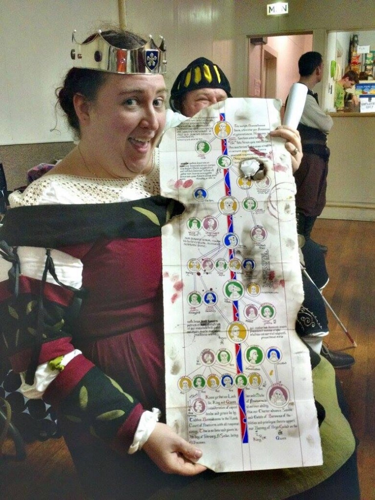
If you notice, the last seven heirs died in a fire (started as they attempted to kill each other to obtain the estate). This family tree and the coronet she was given were the only surviving artifacts. Part of my commission was to make sure that the scroll looked like it had been rescued from a fire. I aged the paper with various washes of watercolor, and added some bloody handprints and splatters. I also painted the paws of my more tolerant cat and had him walk over the back of the scroll. He was very patient and only cried a little bit when I washed the excess paint off him.
Sabina's Court Barony Scroll

I added some wine rings on th front (such careless scribes!) and some more blood splatters and sooty handprints. I was going to make those in charcoal, but it wasn’t wanting to cooperate, so I just used dark grey gouache instead. Then I took a candle and burned the edges, and made soot marks.
Sabina's Court Barony Scroll

The one place I deliberately (mostly) avoided was the legal text. I didn’t want that getting smudged or burned beyond recognition. The hole in th middle accidentally forms a nice portrait window if you fold it over right, too.  Sabina's Court Barony Scroll The scroll all folded up. I actually have some hanging seals to attach, but I thought it’d be easier to do it after the hoopla in court was done. 
Sabina's Court Barony Scroll A clean version of the scroll text, before clean-up. I misspelled her name horribly, but it’s a relatively easy fix.

Photo by Katy Thompson. Used with permission. Photo by Katy Thompson. Used with permission.

And Her Excellency Sabina with her scroll!

Queen’s Champion Award Scroll

I was one of three people asked to make scrolls for the most recent Queen’s Champion event here in Ansteorra (author’s note: this has been in my queue so long that it was no longer the MOST recent Championship. *hangs head*). My compatriots picked the other scrolls, and I jumped on the chance to make the Champion scroll myself. I knew I wanted to make something late-period, since that’s when rapier fighting takes place. I was inspired by the Mira Calligraphiae, a germanic manuscript that’s known for it’s incredible calligraphic hands, super-impressive cadels (the decorative initial letter), and realistic watercolor illustrations. Queen's Champion Scroll

I used a pretty cadel that comes directly from the Mira, and painted the gold in with a mica-based gold paint before inking in the black lines. Thank heavens for light tables, seriously. Queen's Champion Scroll I painted a trompe l’oeil banner with the Queen’s Champion insignia on it, looking as though it was stuck through the paper. The Mira has several plates like this, and on the other side, you can see where the “flag” is stuck through the paper. Love the illusion. Queen's Champion Scroll A shot showing the lovely sheen of the gold. Queen's Champion Scroll And a little maker’s mark.  Queen's Champion Scroll

Super Secret Scroll: Finished!

The scroll is finished, and the title was given this Saturday during court, so I can talk about it now. It’s a Court Barony scroll for Robert de Bray, and it was requested that I include a European dragon of some sort and his coat of arms, all in a vaguely 16th century style. I went through Pinterest looking for suitable medieval depictions of dragons and found this page from a German manuscript (c 1463-1476, so a little early, but I can’t resist a good versal).

Court Barony

I moved the verbal up to the top of the page, to start the words, and made the tail spiral down around the gold bar. I also lengthened the top border to go all the way to the other margin. I calligraphed the words in my standard blacklister gothic hand, but replaced the capitols with painted letters in blue and red, to match the manuscript.
Court Barony

I didn’t use period pigments on this scroll, because of the time consideration. I had two weeks from commission to delivery, and I knew I wasn’t going to be able to re-do it if I ran into a problem. I used store-bought gouache, and the Majestic Gold pigment from Griffin Dyeworks. 
Court Barony

I wanted to include this picture of the coat-of-arms with a ruler for scale. The little dragon is an inch and a half tall. The details were painted with an insanely tiny liner brush. I am very proud of this wee guy, and the whole scroll, for that matter. 
Court Barony

Calligraph all the things!

I’ve been trying to do as much calligraphy and illumination as I can. One of the really awesome things about tournaments is that most of them require you to submit a letter of intent, stating that you want to fight. It’s a chance to shmooze the Royalty and to show off your (or your friend’s) talents. Well, ladies and gentlemen, I am that friend. I did a letter for my friend Marie:

DSC00706.jpg

One for my friend René (I’m particularly proud of that initial ‘W’):

DSC00708.jpg

DSC00709.jpg

One for Nick (I still think that the shading looks a little chalky):

DSC00710.jpg DSC00712.jpg

And a last minute one for my friend Dena:

Queen's Champion prep

Queen's Champion prep

Oh, and I made the scroll for one of the awards for the Arts and Sciences competition (the one I didn’t win):

Queen's Champion prep Queen's Champion prep Queen's Champion prep

Completed Scroll(s)

The finished Bardic Champion scroll, complete with detail shots. Bardic Champion Award 2013 Bardic Champion Award 2013 Bardic Champion Award 2013 Bardic Champion Award 2013

And since there are several amazing people in our Barony, who were very kind and arranged to bring the Archery scroll I illuminated, I have pictures of that, too. 

Candlemas 2013 Candlemas 2013