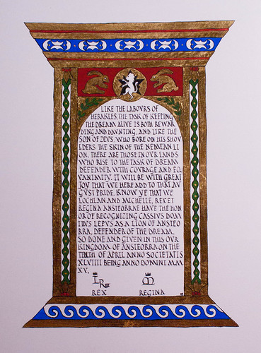
Hey guys! I have this scroll I did, but the person who commissioned it (Her Majesty Michelle) asked me to keep it under wraps until it was finished and given. But now that it has been, I can talk about it! The person in question has a Roman persona, and is often called Rabbit. I wanted to incorporate both of those things into his scroll.
I started off looking at pediments and tabernacle frames. Technically, the one I used for the most inspiration is a Renaissance creation, but it adheres to classical lines, so I went with it. I also looked at mosaic designs and repeating motifs from Pompeii and other Roman sites to add interest to the columns and pediment. I also found some interesting examples of Roman rabbits, and of course, the award badge had to go in there. too. I sketched out my design on graph paper, drawing in one of each motif, since they will get mirrored in the final design, and adding in a branch of Laurel leaves to reference his peerage.
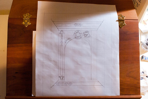
I traced out the text box on another sheet of graph paper and played around with nib size and line spacing until I got it right. This hand is based on the Roman Rustic Capital alphabet in Marc Drogin’s book, although some of the line height and spacing was changed both to make it easier for me to write and to look more like the period examples shown. It only took me two tries to get it right!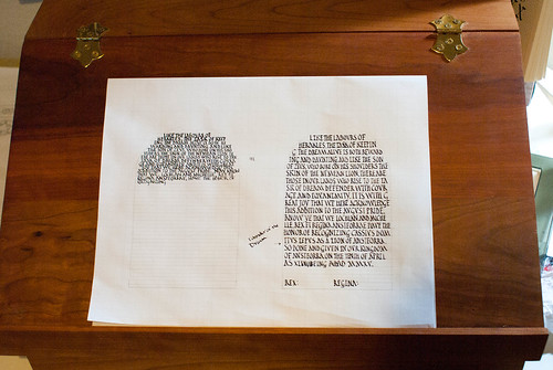
I did somehow manage to get my initial draft off by an inch (the scroll is on 9×12 Fabriano hot press watercolor paper, but my draft was only 9×11), so the scroll is an inch longer than I’d planned it to be. It changed the proportions a bit, but gave me enough room to add in that line in the middle margin that I didn’t have room for in the draft. 
Next up: gilding. I used miniatum as the substrate, and patent rather than loose leaf gold. Patent means that it comes attached to a piece of tissue paper, so you’re not fighting with tiny pieces of tissue thin gold that falls apart with every breath you accidentally blow on it. After the gold is finished, time for painting!
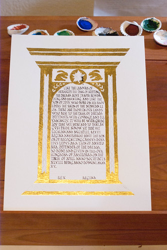
Rabbit is a skilled artisan (there’s a reason they made him a laurel!) and scribe. I wanted to up my game for this scroll, so I used the period pigments that I have been studiously ignoring for the last year. It’s part of my goal this year to work more with period materials and techniques, and I figured: why not start here?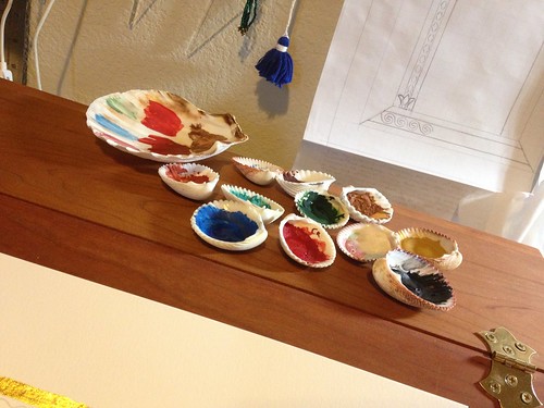
About halfway through laying the flat colors. The paints I used were from Scribal Workshop and Griffon Dyeworks: ultramarine blue, cadmium red (don’t lick your paintbrush!), viridian green, and black. I also used a gold bronze-powder paint to add the dots at the very end.
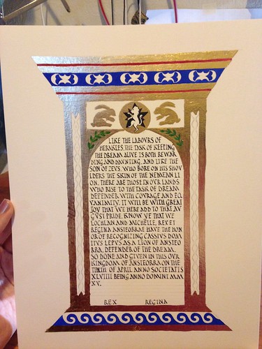
And, finished. I didn’t do any shading at all in the flat areas; I liked the way they looked with flat, graphic colors. The point of the colored areas is to offset and highlight the gold.
Detail shots: You can see how I didn’t manage to get the miniatum 100% smooth under the gold leaf. That’s something I need to work on, and I wonder (since I was trying to go flat gilding as opposed to raised) if I should have used garlic juice instead. But I thought the miniatum would stick better. Next time I’ll thin it out a bit before laying it, and see if that helps the smoothness.

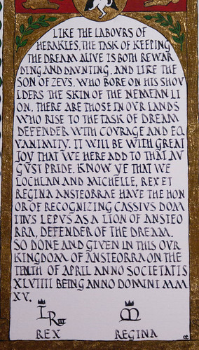
Words. I wasn’t terribly precious about line breaks, preferring to keep a nice full wall of text. Romans didn’t care particularly much about having line breaks in awkward parts of words anyway. My friend Cecilie told me I should have omitted vowels the way they did too, but I said I wanted viewers to be able to actually read it if they tried.
Loving the clean lines and bold colors. 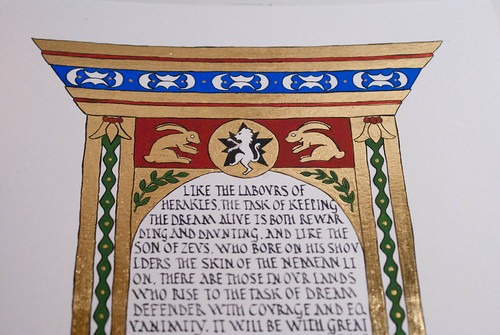
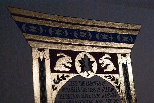
It was really hard to try to photograph the shine of the gold. Either it got blown out completely, like this: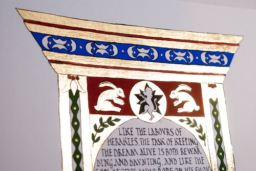
Or the rest of the picture was terribly dark, like this. Suffice it to say: it’s SHINY. Design to finish, this scroll took about 15 hours.